Coimmvest Creative ProcesS
Approach
The approach involved conducting in-depth market research to understand the needs of the real estate investment sector and the expectations of potential users. The branding strategy focused on creating a clean, modern, and approachable identity that would resonate with both experienced investors and newcomers to the real estate market. The objective was to build trust and showcase Coimmvest as a reliable, user-friendly platform.
Challenges
The key challenge was to create a brand identity that balanced the complexities of real estate investment with the simplicity and ease of use that Coimmvest promises. The brand needed to be visually appealing to a diverse audience, ensuring it communicated both professionalism and accessibility.
Concept and Inspiration
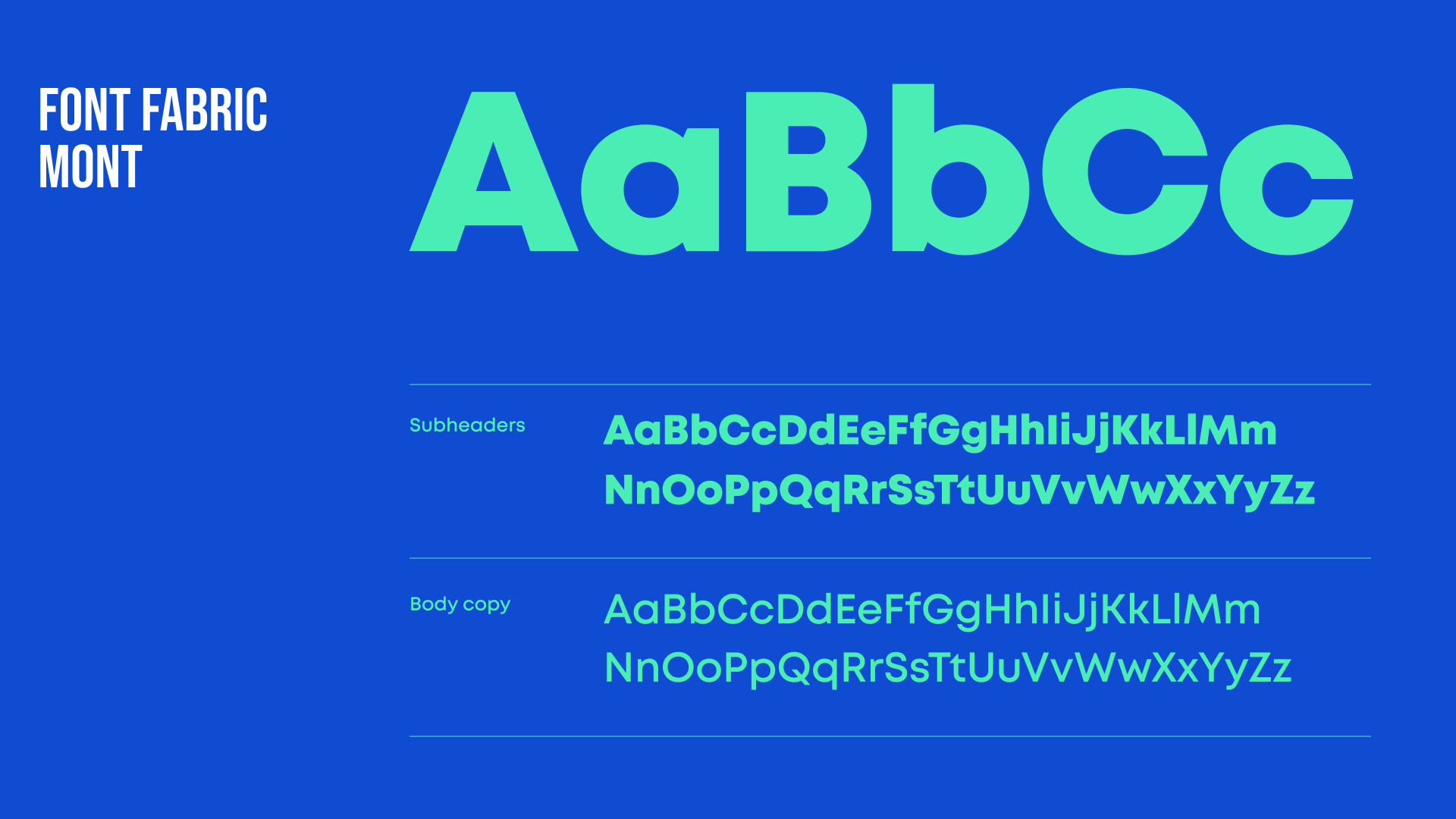
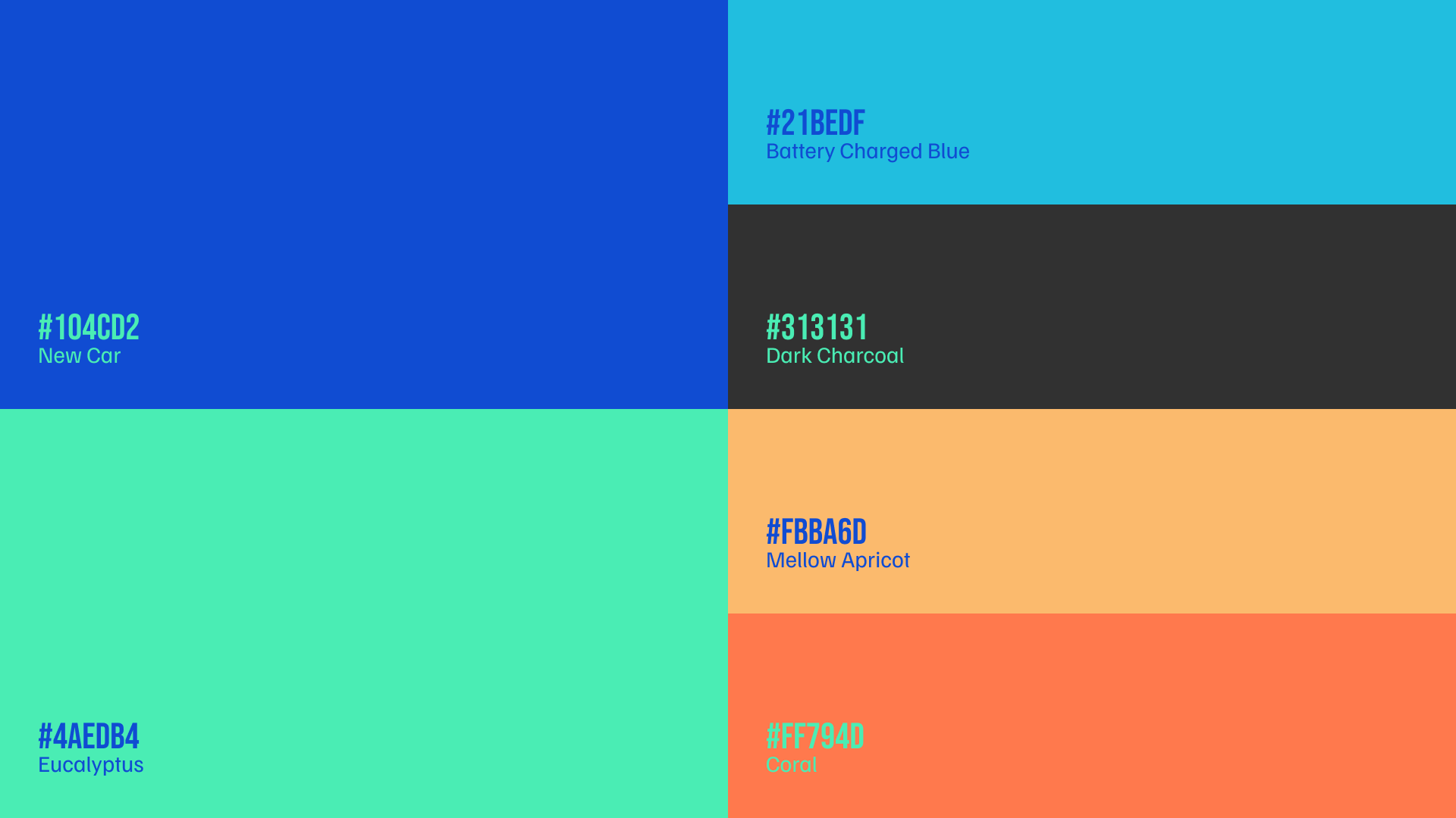
The concept for Coimmvest’s brand identity centered on clarity and modernity. The design drew inspiration from contemporary digital platforms, aiming for a sleek and user-centric visual style. The Mont font was chosen for its modern and versatile characteristics, which align with the brand's forward-thinking approach. The color palette included shades of blue and teal, symbolising trust, stability, and growth—key attributes in the real estate investment world.
Design Execution
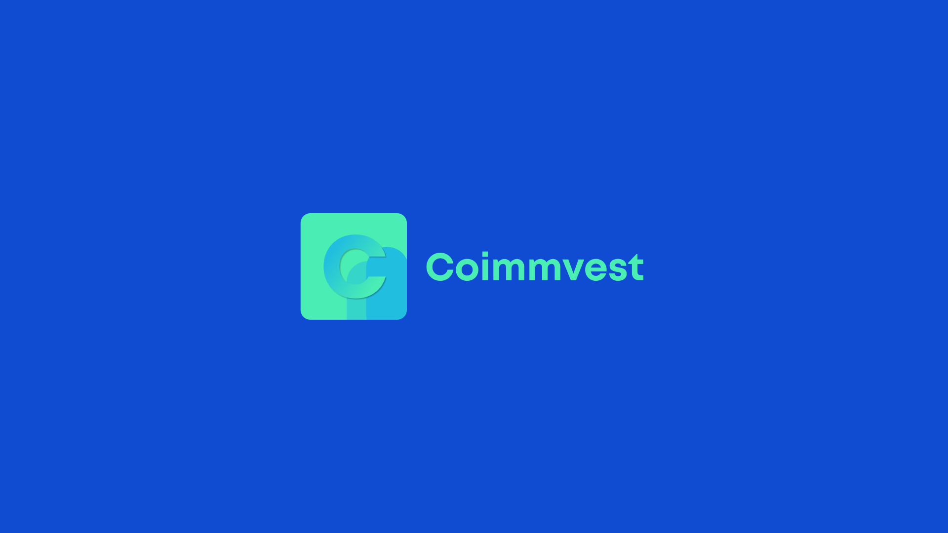
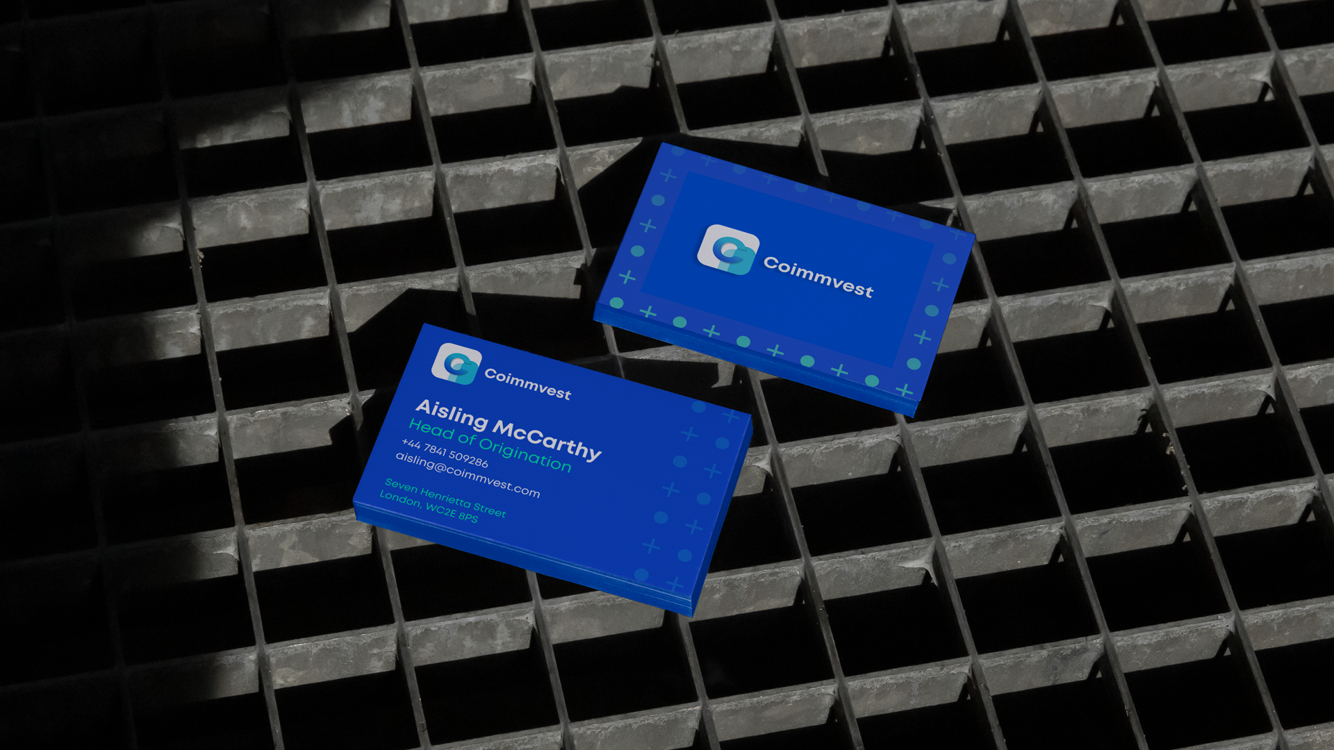
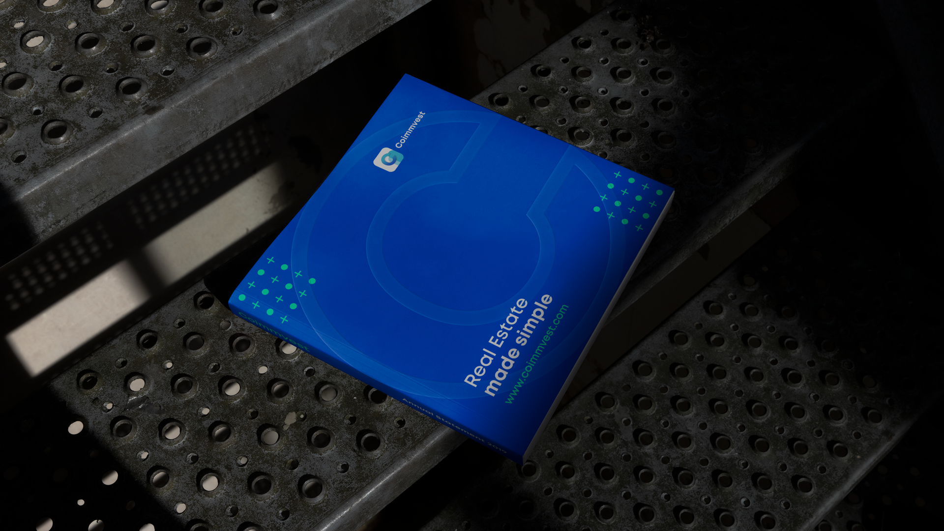
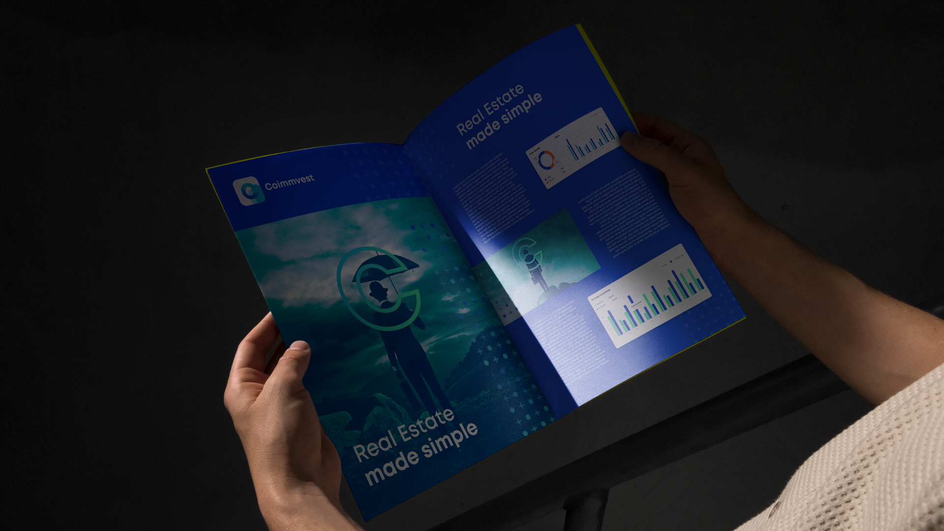
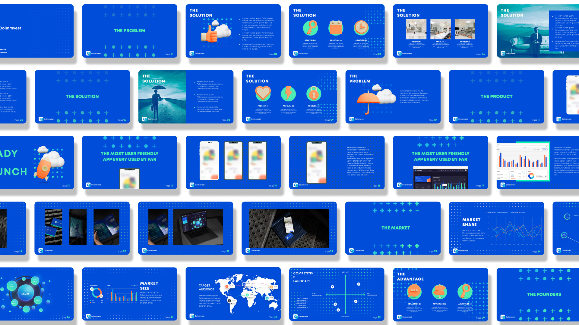
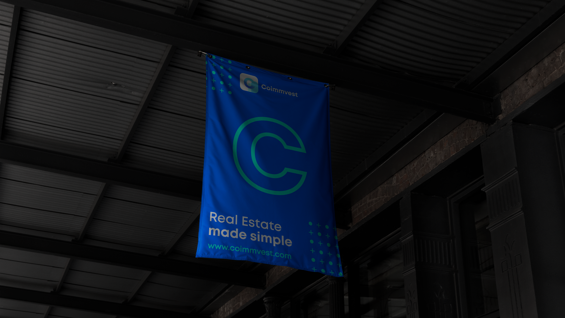
The design execution focused on translating the brand’s mission into a visually cohesive identity. The logo utilized the Mont font in a bold and clean style, with geometric elements incorporated to symbolize growth and investment. The color palette of blues and teals was used consistently across all brand materials, including the website, digital ads, and printed materials, to reinforce a sense of trust and professionalism. The advertisement mockup, as depicted, showcased the brand's messaging and visual elements effectively, ensuring that the brand’s key messages were clear and impactful. The layout was kept simple and modern, with a focus on readability and visual appeal, further enhanced by the strategic use of space and color contrasts.
Outcome
The branding project for Coimmvest culminated in a modern and trustworthy visual identity that positions the company as a leader in simplifying real estate investment. Deliverables included a distinctive logo, a cohesive color palette, and a complete set of brand guidelines to maintain consistency across all platforms. The identity was applied to a range of materials, including digital advertisements, social media assets, and the company’s website, each designed to communicate the brand’s commitment to making real estate investment accessible to everyone.
In summary, Coimmvest’s new brand identity effectively communicates its mission of simplifying real estate investment, combining modern design with a clear and approachable aesthetic. The use of Mont font and a carefully chosen color palette ensures the brand is both contemporary and reliable, appealing to a broad audience while maintaining a strong professional presence in the market.