Therasee Creative ProcesS
Approach
The approach began with in-depth research to understand the wellness market, the specific needs of Therasee's target audience, and the brand's core values. This research informed the development of a brand strategy that aimed to position Therasee as a leader in holistic health, offering a sense of calm and balance through its products and services.
Challenges
The primary challenge was to create a brand identity that stood out in the saturated wellness market while effectively conveying the brand's commitment to holistic health. The identity needed to balance modern wellness trends with a timeless appeal, ensuring that the brand would remain relevant in the long term.
Concept & Inspiration
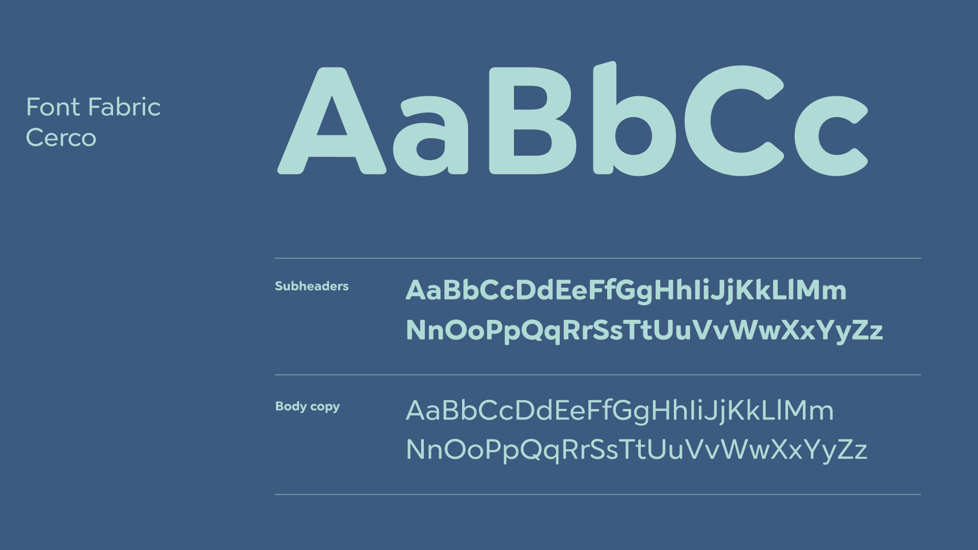
One of the main challenges is balancing freedom and structure. It's essential to ensure that the design elements represent freedom while maintaining a cohesive and structured aesthetic. Another significant challenge is inclusivity, which involves representing a diverse range of ages, genders, and ethnicities in a respectful and engaging manner. Additionally, achieving color harmony is crucial, particularly when working with the primary colors Bay and Sailor alongside the supporting color palette to create a visually appealing and consistent brand identity. Lastly, effective typography is key, utilising Font Fabric Cerco to ensure readability and aesthetic appeal across various media.
Design Execution
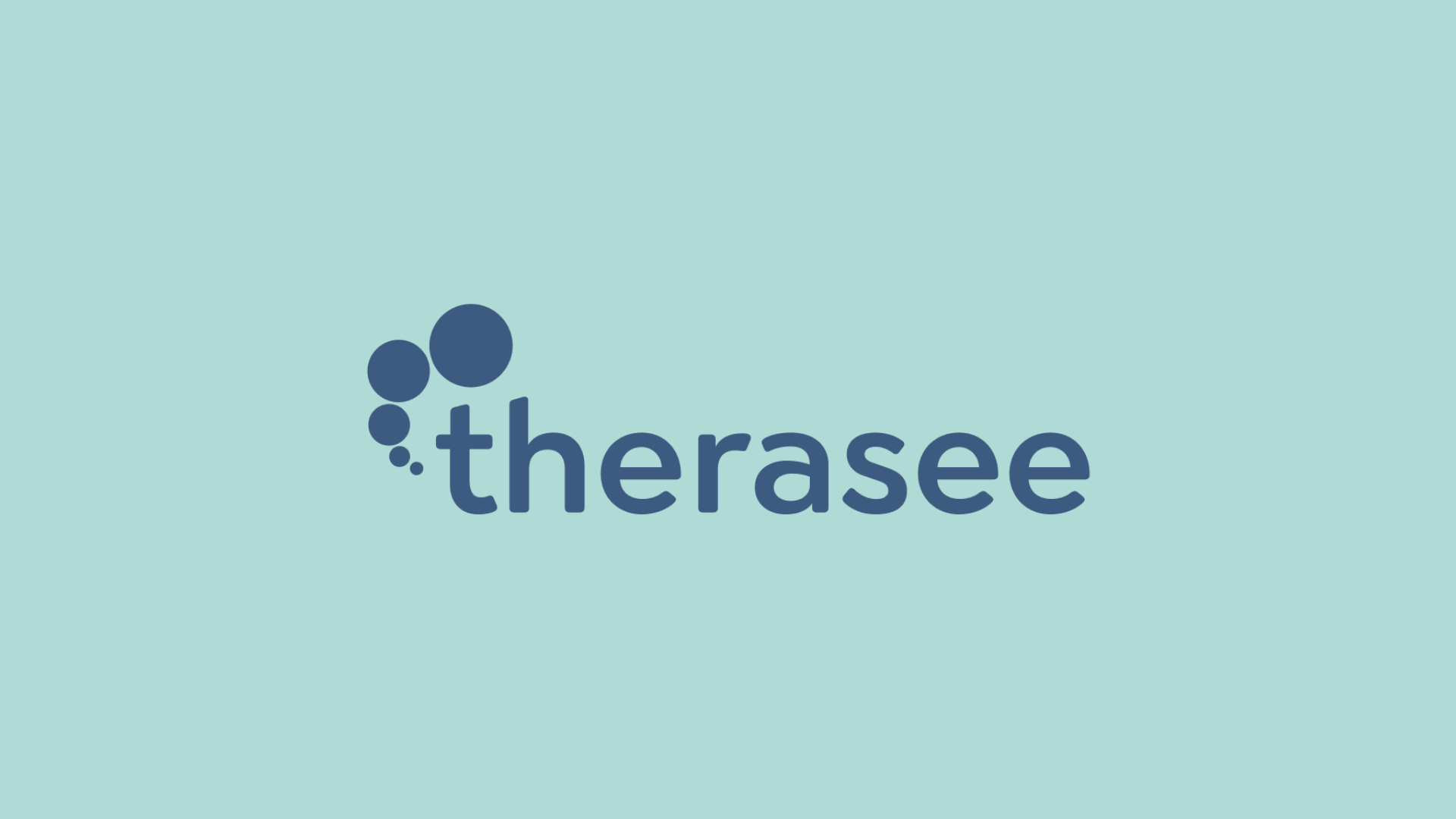
The design execution focused on creating a cohesive visual identity that embodied the brand's values. The logo was designed to be simple yet elegant, using flowing lines and organic shapes to represent the harmony of mind, body, and spirit. The color palette was applied consistently across all brand materials, creating a soothing and cohesive visual experience. A pattern inspired by natural textures was developed and integrated into packaging, digital media, and marketing materials, reinforcing the brand's connection to nature and holistic wellness.
Outcome
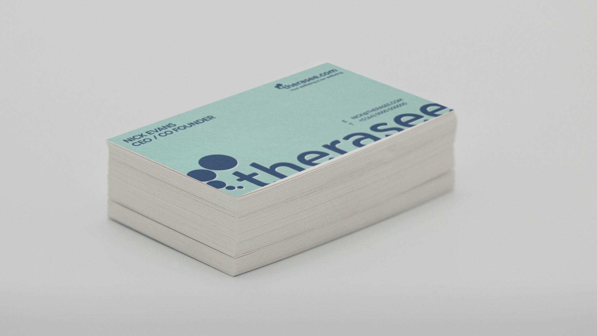
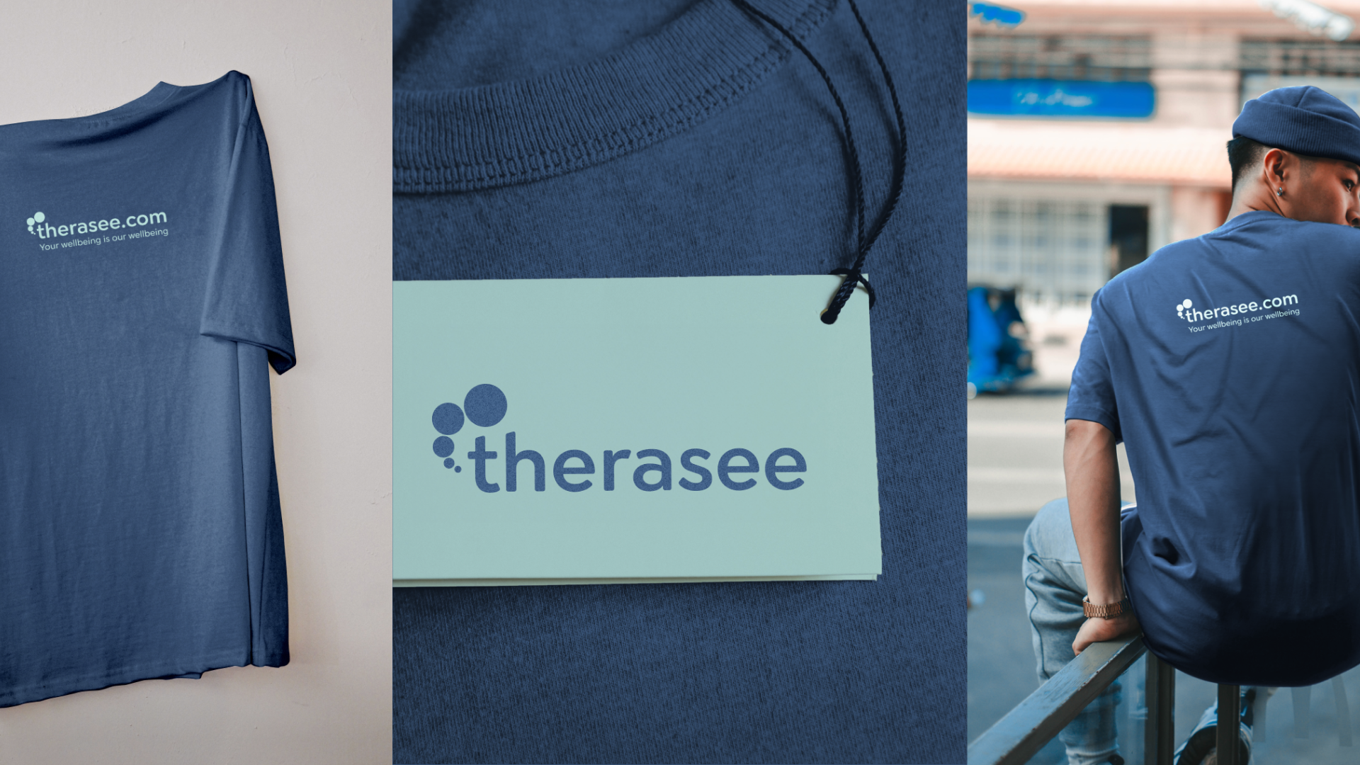
The project resulted in a comprehensive brand identity for Therasee, including a distinctive logo, a calming color palette, and a unique pattern inspired by nature. Visual identity guidelines were created to ensure consistency across all platforms. The brand identity was applied to a range of deliverables, including business cards, product packaging, social media assets, and wellness guides, each designed to reinforce the brand's message of tranquility and balance.
In summary, Therasee successfully established a brand identity that reflects its commitment to holistic wellness, positioning itself as a trusted and innovative player in the wellness industry. Through thoughtful design and strategic execution, the brand is now equipped to connect with its audience on a deeper level, offering a sense of peace and balance in their wellness journey.